While working on custom blocks for clients I often ran into the situation where I want to add color settings. These weren’t always straight forward settings for the text or background colors that we get out of the box with block supports.
We have access to the ColorPicker and ColorPalette components which worked for a while. The ColorPalette component lets you provide a list of colors for the user to select from, but you have to provide the colors.
To simplify things I created a custom component called ThemeColorPalette. I would make use of the useSelect hook to access the block editor store and get the registered colors of the theme and render a ColorPalette Component with these colors.
Here’s what that looked like:
import { ColorPalette } from '@wordpress/components';
import { useSelect } from '@wordpress/data';

export const ThemeColorPalette = (props) => {
	const { value, onChange } = props;

	const themeColors = useSelect((select) => {
		const blockEditorStore = select('core/block-editor');
		return blockEditorStore.getSettings().colors;
	}, []);

	return (
		<ColorPalette colors={themeColors} value={value} onChange={onChange} />
	);
};
Then I could import my component and use it with the attributes of my custom block. Here’s an example of that in a block:
<ThemeColorPalette
  value={accentColor}
  onChange={(newValue) =>
    setAttributes({ accentColor: newValue })
  }
/>
To use a color from a setting I like to use custom properties. I’ll set those properties on the main wrapper of the block so I can use them throughout the block and settings from one block don’t interfere with other blocks.
From my previous example I would create a const with any settings that I need to set as styles. I normally call this blockStyles for consistency.
const blockStyles = {
	'--accent-color': accentColor,
};
...
<div
  {...useBlockProps({
    style: blockStyles,
  })}
>
Enter PanelColorSettings
I’m not entirely sure when this component became available for block developers to use. It was already being used for the Text and Background settings, but it was private and restricted to core components. When searching through the WordPress Developer Resources the only mention of the component is in a deprecation notice.
wp.components.PanelColorcomponent has been removed. Please usewp.editor.PanelColorSettingsinstead.wp.editor.PanelColorcomponent has been removed. Please usewp.editor.PanelColorSettingsinstead.
You can see more information about the component in the main gutenberg repository.
When adding things to <InspectorControls> you can now import and use the <PanelColorSettings> component. This adds a new Panel, so you don’t need to wrap this inside a <PanelBody>. There are two attributes to give the component:
- title
- colorSettings
The Title is the name of the Panel in the sidebar.
The colorSettings is an array of objects for each color setting you need. Each color has a value, an onChange, and a label. The colorSettings will use the registered theme colors as options for each of these color settings. You can pass in an array of color objects and only have these colors available for the setting if you want to restrict certain settings.
Let’s set up a block with the PanelColorSettings and see what happens.
First I created a new block using the create block package. In my block.json I’ll register four color attributes.
{
	"$schema": "https://schemas.wp.org/trunk/block.json",
	"apiVersion": 3,
	"name": "create-block/panel-color-settings",
	"version": "0.1.0",
	"title": "Panel Color Settings",
	"category": "widgets",
	"icon": "smiley",
	"description": "Example block scaffolded with Create Block tool.",
	"example": {},
	"supports": {
		"html": false
	},
	"attributes": {
		"colorOne": {
			"type": "string"
		},
		"colorTwo": {
			"type": "string"
		},
		"colorThree": {
			"type": "string"
		},
		"colorFour": {
			"type": "string"
		}
	},
	"textdomain": "panel-color-settings",
	"editorScript": "file:./index.js",
	"editorStyle": "file:./index.css",
	"style": "file:./style-index.css",
	"viewScript": "file:./view.js"
}
We can set defaults here, but we’ll take a look at that in a minute.
In my edit.js I add the ColorPanelSettings to my InspectorControl. I also output four div’s, one for each of the colors.
import { __ } from "@wordpress/i18n";
import {
	InspectorControls,
	PanelColorSettings,
} from "@wordpress/block-editor";
import { useBlockProps } from "@wordpress/block-editor";
import "./editor.scss";
export default function Edit({ attributes, setAttributes }) {
	const {
		colorOne,
		colorTwo,
		colorThree,
		colorFour,
	} = attributes;

	const blockStyles = {
		"--color-one": colorOne,
		"--color-two": colorTwo,
		"--color-three": colorThree,
		"--color-four": colorFour,
	};
	return (
		<>
			<InspectorControls group="styles">
				<PanelColorSettings
					__experimentalIsRenderedInSidebar
					title={__("Color Settings", "panel-color-settings")}
					colorSettings={[
						{
							value: colorOne,
							onChange: (value) => setAttributes({ colorOne: value }),
							label: __("Color One"),
						},
						{
							value: colorTwo,
							onChange: (value) => setAttributes({ colorTwo: value }),
							label: __("Color Two"),
						},
						{
							value: colorThree,
							onChange: (value) => setAttributes({ colorThree: value }),
							label: __("Color Three"),
						},
						{
							value: colorFour,
							onChange: (value) => setAttributes({ colorFour: value }),
							label: __("Color Four"),
						},
					]}
				/>
			</InspectorControls>
			<div {...useBlockProps({ style: blockStyles })}>
				<div className="color-one">Color One</div>
				<div className="color-two">Color Two</div>
				<div className="color-three">Color Three</div>
				<div className="color-four">Color Four</div>
			</div>
		</>
	);
}
You can see I’m taking the values of each of my attributes and setting them as a custom property. In my styles I’m setting each div to use that custom property as a background color.
.wp-block-create-block-panel-color-settings {
text-align: center;
> div {
padding: 0.5rem;
margin-top: 0.25rem;
}
.color-one {
background-color: var(--color-one);
}
.color-two {
background-color: var(--color-two);
}
.color-three {
background-color: var(--color-three);
}
.color-four {
background-color: var(--color-four);
}
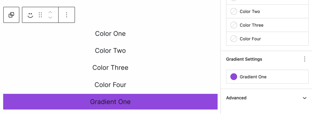
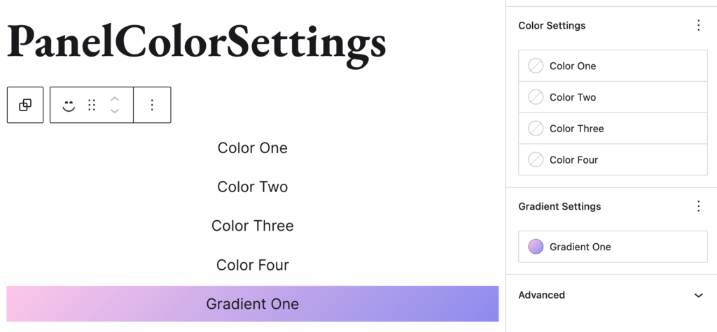
}Now in my editor I get my block and see my new color panel settings in the sidebar.
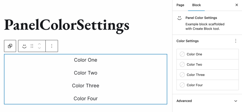
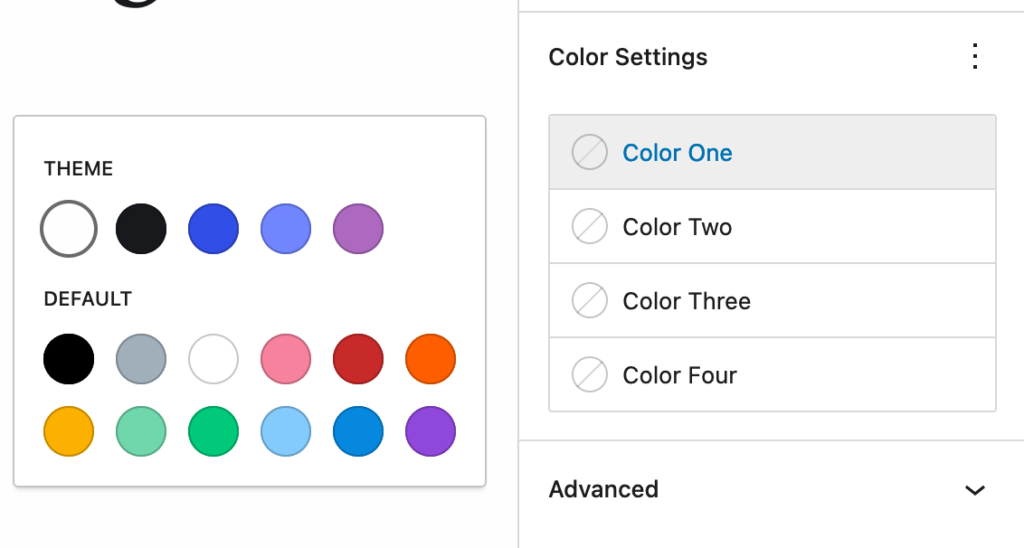
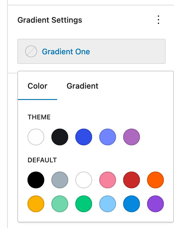
Clicking on one of these colors will open a popover component with both the theme colors and the default core colors (if they are still enabled).
After I select a color I’ll instantly see it show up in my block. The block gets re-rendered with our new settings and custom css properties so the colors are set.
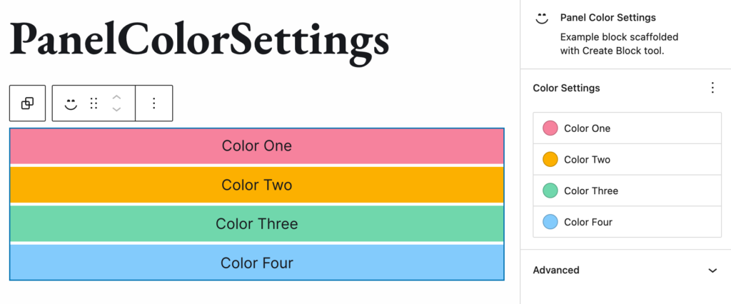
You can now use these colors however you like in your blocks.
Adding Gradient Control
You may have noticed that unlike the color background color panel we don’t have access to gradients with the PanelColorSettings.
Here is that background color control on a paragraph:
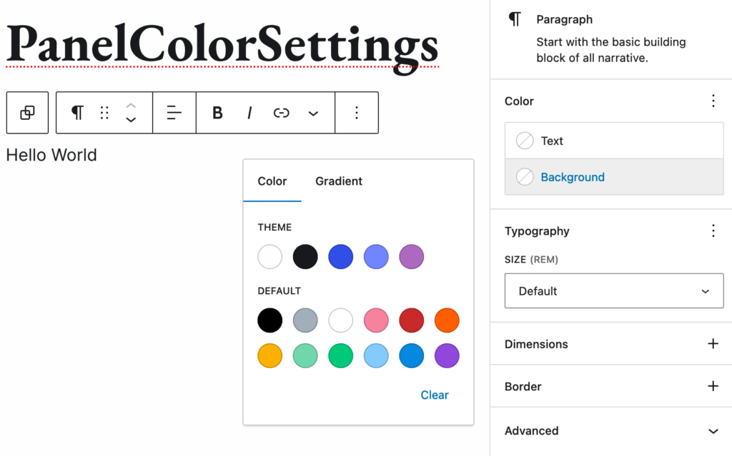
To get controls like this we have to use the <PanelColorGradientSettings> which as of this writing (8/25/2024 WP 6.6.1), is still an experimental component. So use at your own risk.
Let’s add on another setting to our previous example to make use of gradient color controls.
First I’ll add in two more attributes:
{
  ...
  "attributes": {
    ...
    "colorFive": {
			"type": "string"
		},
		"gradientOne": {
			"type": "string"
		}
	}
}
Then we’ll import the experimental component into our edit.js
import {
	InspectorControls,
	PanelColorSettings,
	__experimentalPanelColorGradientSettings as PanelColorGradientSettings,
} from "@wordpress/block-editor";
The PanelColorGradientSettings are similar to the PanelColorSettings, but with a few key changes.
In my edit.js I’ll add this new component below my previous PanelColorSettings
<PanelColorGradientSettings
	title={__("Gradient Settings", "panel-color-settings")}
	settings={[
		{
			colorValue: colorFive,
			gradientValue: gradientOne,
			onColorChange: (value) => setAttributes({ colorFive: value }),
			onGradientChange: (value) =>
				setAttributes({ gradientOne: value }),
			label: __("Gradient One"),
		},
	]}
/>
We still have a title, but now the colorSettings property is just settings. This still takes an array of objects, but each object has both color and gradient settings. These are optional, you could add just a color, or just a gradient. Adding both is what gives you the tab controls in the color popover.
Just like with the ColorPanelSettings you can supply your own colors and gradients in this object. Doing so will only show those colors and none of the theme or core defaults. Omitting those will just use the theme and core default colors.
Depending on what setting we choose will determine what attribute is updated. For instance if we choose the purple default color and console log our blockStyles object:
{
  "--color-one": undefined,
  "--color-two": undefined,
  "--color-three": undefined,
  "--color-four": undefined,
  "--color-five": "#9b51e0",
  "--gradient-one": undefined,
}
The --color-five attribute has been set, but not the --gradient-one.
If we open the setting again and now choose a gradient color we get the following in the console:
{
  "--color-one": undefined,
  "--color-two": undefined,
  "--color-three": undefined,
  "--color-four": undefined,
  "--color-five": undefined,
  "--gradient-one": "linear-gradient(135deg,rgb(255,206,236) 0%,rgb(152,150,240) 100%)",
 }
The color is now undefined and the gradient shows are value. To output this on my div I’ll want to use whichever one of these is used. To do this I’ll set the color as the default value for my custom property.
.gradient-one {
  background: var(--gradient-one, var(--color-five));
}
Now if the color is picked the –gradient-one value is undefined so the default –color-five is used. If however the gradient is chosen that is is present and we don’t use the default.
Wrapping things up
Next time you’re looking to add custom colors to your block you can reach for either the <PanelColorSettings> or the <PanelColorGradientSettings> components.
Happy Coloring!
Leave a Reply