After a few years of working with the Block Editor on a daily basis I’ve come across common issues that need solving. Having a core plugin set up that I can drop in extensions, components, and blocks makes these fixes easy.
One issue that comes up is a two column section with wide content in each column. This doesn’t always play nice with the default breakpoints. They stack for mobile, and then when they go side-by-side the content is still very squished.
It’s not always the same custom breakpoint that needed, so adding a block style wouldn’t work. Plus adding block styles isn’t the best way to handle something like a custom breakpoint.
Block Extensions
Registering an extension allows you to add settings to Core or 3rd Party Plugin Blocks. This allows you and your clients to use the Core blocks but with custom controls.
You’ll always want to be careful when you’re extending Core blocks. It’s easy to make a change that then causes a block invalidation or ‘breaks’ all instances of the block in the editor.
Using 10up’s registerBlockExtension
I’ve been including 10up’s Block Components package in most of my projects. They provide some nice components and tools to speed up your development. The registerBlockExtension() function is easier than writing all the filters necessary. You can read more about Block Extension details from 10up in their Gutenberg Best Practices.
So let’s dive in.
What do we need?
My goal for this extension is to add a toggle to enable the custom breakpoint. Then have an input to allow me to set a value for the breakpoint. That’s the first step. Then we’ll need to add the necessary css to make it all work.
First lets take a look at the block extension function and what it needs.
registerBlockExtension( 'core/columns', {
	extensionName: 'break-on-custom-breakpoint',
	attributes: additionalAttributes,
	classNameGenerator: generateClassName,
	Edit: ColumnsEdit,
});
First is the name of the block that we want to extend. For this example I’m extending the core/columns block. Next is an object with four properties.
- extensionName: A name for your extension.
- attributes: An object of attributes
- classNameGenerator: A function that will return a string. This string will be added to your blocks classes.
- Edit: A React component that will be added to the editor. Using the
<BlockToolbar>or<InspectorControls>slots are recommended
Now that we know what we need, let’s start with our extension. First we import the block-components, and create our additional attributes.
import { registerBlockExtension } from '@10up/block-components';

const additionalAttributes = {
	isStackedOnCustom: {
		type: 'boolean',
		default: false,
	},
	customBreakpoint: {
		type: 'string',
		default: '781',
	},
};
The attributes object is structured just like custom attributes you would add to your block.json file. Here I’ve added two new attributes: a boolean for my toggle, and a string for my custom breakpoint.
Next we will create a function to add a class to the block when these attributes are present.
function generateClassName(attributes) {
	const { isStackedOnCustom } = attributes;
	let className = '';
	if (isStackedOnCustom) {
		className = `is-stacked-on-custom-${attributes.customBreakpoint}`;
	}

	return className;
}
This function receives the attributes of the block, so we’ll destructure it to get our new attribute value. If my toggle was enabled and the value is true, then we will add a custom class that uses the value of the custom breakpoint.
I’ve done this so that multiple columns on the page could have their own custom breakpoints. It will make more sense when we get to the CSS.
This is all we need for our index.js file. Here it is in completion.
import { registerBlockExtension } from '@10up/block-components';
import ColumnsEdit from './edit';
import './save';

const additionalAttributes = {
	isStackedOnCustom: {
		type: 'boolean',
		default: false,
	},
	customBreakpoint: {
		type: 'string',
		default: '781',
	},
};

function generateClassName(attributes) {
	const { isStackedOnCustom } = attributes;
	let className = '';
	if (isStackedOnCustom) {
		className = `is-stacked-on-custom-${attributes.customBreakpoint}`;
	}

	return className;
}

registerBlockExtension('core/columns', {
	extensionName: 'break-on-custom-breakpoint',
	attributes: additionalAttributes,
	classNameGenerator: generateClassName,
	Edit: ColumnsEdit,
});
You’ll notice lines 2 and 3 are importing additional files. The Edit react component I’ll build in a separate file to keep things neater. The same for the save function.
The Edit Function
The Edit Function needs to be a react element that adds additional settings. You wont be exporting anything to the block itself, just the <InspectorControls> or <BlockControls> slots.
Here’s what I’ve built for this Edit function
import { __ } from '@wordpress/i18n';
import { InspectorControls } from '@wordpress/block-editor';
import { PanelBody, ToggleControl, TextControl } from '@wordpress/components';

export default (props) => {
	const { attributes, setAttributes } = props;
	const { isStackedOnMobile, isStackedOnCustom, customBreakpoint } =
		attributes;

	const onChangeCustomStacking = (value) => {
		setAttributes({ isStackedOnCustom: value });
		if (isStackedOnMobile && value === true) {
			setAttributes({ isStackedOnMobile: false });
		}
	};

	return (
		<InspectorControls>
			<PanelBody title={__('Custom Breakpoint')}>
				<ToggleControl
					label={__('Stack on Custom')}
					checked={isStackedOnCustom}
					onChange={onChangeCustomStacking}
				/>
				{isStackedOnCustom && (
					<TextControl
						label={__('Breakpoint in pixels')}
						value={customBreakpoint}
						onChange={(value) =>
							setAttributes({ customBreakpoint: value })
						}
					/>
				)}
			</PanelBody>
		</InspectorControls>
	);
};
Just like building a custom block we will destructure our attributes from the block props. Since we’ve registered our custom attributes we have access to those here, but you could also access any of the default attributes on the block. Here the isStackedOnMobile attribute is a default one.
In my InspectorControls Slotfill I’ve added a PanelBody with two controls. the first is my toggle to enable the custom breakpoint. In the onChange function I first use setAttributes to update my custom attribute isStackedOnCustom. Then I check if the core attribute isStackedOnMobile is available and if I’m enabling my toggle. If so then we can change the isStackedOnMobile to false. Now we wont have an additional class on our block that might need overriding.
If the toggle has been enabled, then we’ll show the TextControl to allow a custom value to be added. I’m using a TextControl component, and in my styles I’ll set this to value to pixles. You could you any other unit if you prefer.
UnitControl Alternative
I use this for a couple sites that use pixels for breakpoint sizes, so I’ve built it in just to use pixels. If you prefer another unit or you want to build in some flexibility you could opt to use the UnitControl component. Note this is still an experimental component, so use at your own risk.
import { __experimentalUnitControl as UnitControl } from '@wordpress/components';

...

<UnitControl
	label={__('Breakpoint')}
	value={customBreakpoint}
	onChange={(value) =>
		setAttributes({ customBreakpoint: value })
	}
	units={[
		{ value: 'px', label: 'px' },
		{ value: 'em', label: 'em' },
		{ value: 'rem', label: 'rem' },
	]}
/>
UnitControl works the same as TextControl, but you can also pass in an array to the units property to customize what units are available. Omitting this property will add all of the default units. The units are in a select box on the right of the input.
For a breakpoint size it doesn’t make much sense to include percentage, or viewport width/height. So I’ve opted to just use px, em, and rem. The unit is automatically appended to the end of the value when you save it.
Adding the CSS
So far we’ve added the edit controls to the InspectorControls, and added a class to the block when the custom styles are applied. Now we need to include CSS so the new breakpoint is used.
Here is the save.js file that we included in the index.js.
wp.hooks.addFilter(
	'blocks.getSaveElement',
	`rb/core/columns/break-on-custom-breakpoint/breakpoint-styles`,
	function (element, block, attributes) {
		if (block.name !== 'core/columns') {
			return element;
		}

		if (attributes.isStackedOnCustom ?? false) {
			const css = `
            .wp-block-columns.is-not-stacked-on-mobile.is-stacked-on-custom-${attributes.customBreakpoint} {
                flex-wrap: wrap !important;
            }
            @media (min-width: ${attributes.customBreakpoint}px ) {
                .wp-block-columns.is-not-stacked-on-mobile.is-stacked-on-custom-${attributes.customBreakpoint} {
                    flex-wrap: nowrap !important;
                }
            }
            @media (max-width: calc(${attributes.customBreakpoint}px - 1px)) {
                .wp-block-columns.is-not-stacked-on-mobile.is-stacked-on-custom-${attributes.customBreakpoint} > .wp-block-column {
                    flex-basis: 100% !important;
                }
            }
        `;

			return (
				<>
					{element}
					<style>{css}</style>
				</>
			);
		}

		return element;
	}
);
The blocks.getSaveElement filter will run when we save the content. If you make a change after you have saved the block it will cause a validation error on the block. Using the “Attempt Block Recovery” should be fine and not affect any of the content.
We get three variables passed into the function for this filter. The element, which is the html content of the block. Next is block which contains all of the block details. And finally an object of all the attributes.
Registered filters will run on every block, so first we make sure we are dealing with a core/columns block.
Then we make sure our custom attribute isStackedOnCustom is true. When it is we’ll build our css and return it in an inline style tag right after the element’s html.
For the CSS we need to do three things
const css = `
    .wp-block-columns.is-not-stacked-on-mobile.is-stacked-on-custom-${attributes.customBreakpoint} {
        flex-wrap: wrap !important;
    }
    @media (min-width: ${attributes.customBreakpoint}px) {
        .wp-block-columns.is-not-stacked-on-mobile.is-stacked-on-custom-${attributes.customBreakpoint} {
            flex-wrap: nowrap !important;
        }
    }
    @media (max-width: calc(${attributes.customBreakpoint}px - 1px)) {
        .wp-block-columns.is-not-stacked-on-mobile.is-stacked-on-custom-${attributes.customBreakpoint} > .wp-block-column {
            flex-basis: 100% !important;
        }
    }
`;
First we set the columns with our custom class to use flex-wrap: wrap !important. I don’t like using the !important flag, but we need to override the default core library styles which uses an important flag when the .is-not-stacked-on-mobile class is added.
Second we add in the media query, using our customBreakpoint and then set the columns to use flex-wrap: nowrap . These are the same things that core is doing, we’re just changing where the break is happening.
Lastly we also need to take care of the columns inside the columns block. The core block library will set the column to use a flex-basis of 0 when the .is-not-stacked-on-mobile class is present. This wouldn’t let the column fill the space so we’ll want that set at 100% until one pixel before our custom breakpoint.
All the final code in one place
import { registerBlockExtension } from '@10up/block-components';
import ColumnsEdit from './edit';
import './save';

const additionalAttributes = {
	isStackedOnCustom: {
		type: 'boolean',
		default: false,
	},
	customBreakpoint: {
		type: 'string',
		default: '781',
	},
};

function generateClassName(attributes) {
	const { isStackedOnCustom } = attributes;
	let className = '';
	if (isStackedOnCustom) {
		className = `is-stacked-on-custom-${attributes.customBreakpoint}`;
	}

	return className;
}

registerBlockExtension('core/columns', {
	extensionName: 'break-on-custom-breakpoint',
	attributes: additionalAttributes,
	classNameGenerator: generateClassName,
	Edit: ColumnsEdit,
});import { __ } from '@wordpress/i18n';
import { InspectorControls } from '@wordpress/block-editor';
import { PanelBody, ToggleControl, TextControl } from '@wordpress/components';
export default (props) => {
const { attributes, setAttributes } = props;
const { isStackedOnMobile, isStackedOnCustom, customBreakpoint } =
attributes;
const onChangeCustomStacking = (value) => {
setAttributes({ isStackedOnCustom: value });
if (isStackedOnMobile && value === true) {
setAttributes({ isStackedOnMobile: false });
}
};
return (
<InspectorControls>
<PanelBody title={__(' Custom Breakpoint')}>
<ToggleControl
label={__('Stack on Custom')}
checked={isStackedOnCustom}
onChange={onChangeCustomStacking}
/>
{isStackedOnCustom && (
<TextControl
label={__('Breakpoint in pixels')}
value={customBreakpoint}
onChange={(value) =>
setAttributes({ customBreakpoint: value })
}
/>
)}
</PanelBody>
</InspectorControls>
);
};wp.hooks.addFilter(
'blocks.getSaveElement',
`rb/core/columns/break-on-custom-breakpoint/breakpoint-styles`,
function (element, block, attributes) {
if (block.name !== 'core/columns') {
return element;
}
if (attributes.isStackedOnCustom ?? false) {
const css = `
.wp-block-columns.is-not-stacked-on-mobile.is-stacked-on-custom-${attributes.customBreakpoint} {
flex-wrap: wrap !important;
}
@media (min-width: ${attributes.customBreakpoint}px) {
.wp-block-columns.is-not-stacked-on-mobile.is-stacked-on-custom-${attributes.customBreakpoint} {
flex-wrap: nowrap !important;
}
}
@media (max-width: calc(${attributes.customBreakpoint}px - 1px)) {
.wp-block-columns.is-not-stacked-on-mobile.is-stacked-on-custom-${attributes.customBreakpoint} > .wp-block-column {
flex-basis: 100% !important;
}
}
`;
return (
<>
{element}
<style>{css}</style>
</>
);
}
return element;
}
);Including this code in a plugin
I mentioned at the top that I would drop this extension into my sites where they might need it. Here’s how I structure my plugin to allow custom blocks and extensions to reside in one place.
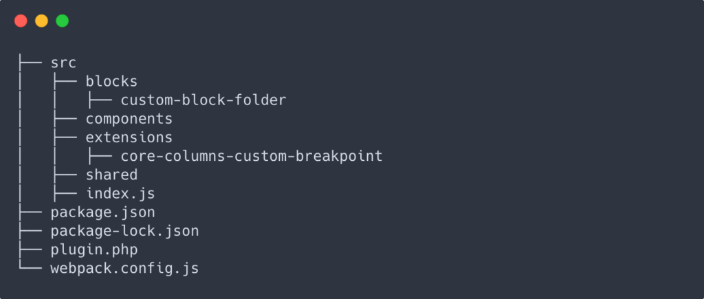
My plugin package.json uses the @wordpress/scripts. This will handle finding all of the folders with a block.json and rendering those in the build directory.
The scripts package webpack configuration get’s us most of the way there, but we need to extend it to also include our additional extensions and anything else we may need.
// Import the original config from the @wordpress/scripts package.
const defaultConfig = require('@wordpress/scripts/config/webpack.config');

// Import the helper to find and generate the entry points in the src directory
const { getWebpackEntryPoints } = require('@wordpress/scripts/utils/config');

// Add any a new entry point by extending the webpack config.
module.exports = {
	...defaultConfig,
	entry: {
		...getWebpackEntryPoints(),
		index: './src/index.js',
	},
};
Then I can include any new extensions in my src/index.js file and they’ll get packaged up and added to the build directory.
In my plugin.php file I’ll enqueue this script with my extensions, as well as register any custom blocks.
function prefix_blocks_block_init() {

	$build_dir = plugin_dir_path( __FILE__ ) . 'build/blocks';

	$blocks = glob( $build_dir . '/*' );
	$blocks = array_map(
		function ( $block_name_path ) {
			return basename( $block_name_path );
		},
		$blocks
	);

	foreach ( $blocks as $block ) {

		$block_location = $build_dir . '/' . $block;
		if ( ! is_dir( $block_location ) ) {
			continue;
		}
		register_block_type( $block_location );
	}
}
add_action( 'init', 'prefix_blocks_block_init' );

function prefix_enqueue_block_scripts() {

	$index_assets = plugin_dir_path( __FILE__ ) . 'build/index.asset.php';

	if ( file_exists( $index_assets ) ) {
		$assets = require_once $index_assets;
		wp_enqueue_script(
			'prefix-blocks',
			plugin_dir_url( __FILE__ ) . '/build/index.js',
			$assets['dependencies'],
			$assets['version'],
			true
		);
	}
}
add_action( 'enqueue_block_editor_assets', 'prefix_blocks_enqueue_block_scripts' );
The top function builds a list of blocks in the build directory and automatically registers them. Now I just need to add another block, start the build process and it will be registered.
The second function will enqueue my script file, and uses the index.asset.php file to list the dependencies and version for cache busting.
I hope this helps
After using and working with the Block Editor I’m becoming much more comfortable adding and extending it to my liking. And with each new update we have more options and tools at our disposal. If you’ve made it this far I hope this information was helpful. Thanks for reading!
Leave a Reply